Reading the Optical Line
Why a ruler gets the spacing wrong and a trained eye gets it right.
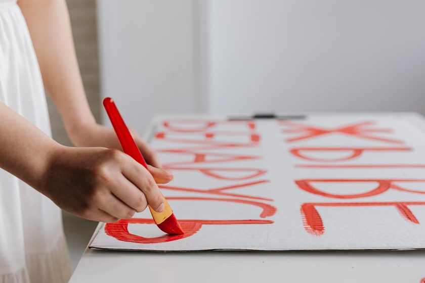
On a wet Tuesday in a shop that still smells faintly of turpentine and chalk dust, a painter named Costas holds a folded slip of paper against a half-marked fascia and just looks at it. The straightedge is still in the toolbox. He isn't measuring the gap between the O and the P — he's reading it, the way he's read ten thousand letter pairs before this one, and what his eye tells him doesn't match what a ruler would insist on. This is the disagreement at the center of every hand-lettered sign meant to be read from across a street: optical spacing against metric spacing, and the two part ways exactly where the reading gets hardest.
What the Ruler Actually Measures
A ruler is honest about exactly one thing: the straight-line distance between two points. Laid against a row of capital letters, it reports the gap between the right edge of one letterform's bounding box and the left edge of the next, and it reports that number with total confidence regardless of what shape actually sits inside those edges. The trouble is that almost no letter fills its own bounding box evenly. A capital H runs full height and nearly full width on both sides, ink pressed right up against the invisible rectangle that contains it. A capital O does nothing of the sort — its curve falls away from that rectangle on every side, leaving quiet corners of white the ruler never accounts for, because the ruler was never measuring the letter. It was measuring the box.
The Letters That Lie About Their Own Width
Three families of letters cause most of the trouble on a layout: the straight-sided (H, I, L, N), the round (O, C, G, Q), and the pointed (A, V, W, and to a lesser degree T and Y). Set a straight-sided pair at a given ruler distance and the word reads correctly, since both letters carry their weight all the way to the edge of the box. Set that same ruler distance next to a round letter and the gap suddenly looks wider than its neighbors, because the curve's shoulder has already retreated inward before the measured gap even begins. Pointed letters split the difference unevenly along their own height — tight near the base, open near the tip — which is part of why a fixed rule like a flat quarter-inch between every pair tends to break down the moment a word mixes letterforms, and almost every word does.
Marking a Fascia by Eye
Watch a sign painter lay out a name on a board and the sequence rarely opens with a tape measure. A chalk line gets snapped for the baseline, the letters get blocked in loosely with a soft pencil — full width, rough spacing — and then the painter steps back from the board, sometimes clear across the shop, to view the word from something close to the distance it will actually be read at. Gaps get closed beside a round letter, opened beside a straight one, and the whole line gets read again before a brush touches paint. Some painters keep a hand mirror on the bench for exactly this step, since a reversed word breaks the habit of reading it as language and leaves only the shapes to judge. None of this is guesswork. It's a correction built on the same instinct a type designer relies on when kerning a typeface, just worked by hand, board by board, letter pair by letter pair.
A ruler will tell you the exact distance between two shapes. It has never once told you whether the word between them looks even from across the street.
That gap between what's measured and what's seen is why a metrically perfect layout can still look wrong hanging twelve feet up on a shopfront, and why a layout that would fail a ruler check can read as perfectly even from the sidewalk. The eye isn't sloppier than the ruler in this exchange. It's simply answering a different question, and the trained hand behind a brush that does not forget is largely what turns that answer into something reliable rather than a guess repeated over a career.
A way to check your own eye: photograph the loose layout on a phone and shrink the image down to a thumbnail, or squint at the board from across the room. Reducing the scale strips away the temptation to measure mechanically, and any gap that reads unevenly at that distance will usually read unevenly from the street as well.
A Working Table of Common Corrections
None of what follows is a fixed formula — typeface, board size, and viewing distance all shift it slightly — but these are the pairings that turn up on nearly every hand-lettered job.
| Letter pairing | What the ruler suggests | Typical optical correction | Why |
|---|---|---|---|
| Two straight stems (H beside N) | Equal ruler gap reads correctly | Little to no adjustment | Both letters carry weight to the very edge of their own box |
| Straight stem beside a round letter (N beside O) | Equal ruler gap looks too wide | Close the gap slightly | The curve's shoulder retreats from its own bounding box, leaving false air |
| Two round letters together (O beside O) | Ruler gap looks widest of all | Close further than a single round pairing | Both letters lose density near the edge, compounding the gap |
| Pointed letter beside a straight one (A beside N) | Ruler gap reads uneven top to bottom | Close near the point, hold ruler distance near the base | The point carries almost no weight where the stem carries full weight |
| A numeral or punctuation beside a capital | Ruler gap often reads too tight | Open the gap slightly | Small forms need more breathing room than their measured width suggests |
Why the Correction Still Has to Be Learned by Hand
None of this transfers cleanly to a printed rule, which is part of why optical spacing tends to stay a shop skill passed hand to hand rather than a formula written down and followed. A few habits do seem to shorten the time it takes to develop it:
- Mark the same short word a dozen times on scrap board, varying only the spacing, then compare the results from across the room rather than up close.
- Lay a metrically even version of a word beside an optically corrected one and note exactly where the eye starts to disagree with the tape.
- Practice on round-heavy words first — a name full of O's and C's exposes optical gaps faster than one built mostly from straight stems.
- Come back to a finished layout the next morning, with a rested eye, before committing it to paint.
It takes longer than most people expect, and it rarely announces the moment it clicks. One board simply starts looking right without a ruler in hand, and the next board after it does too — and somewhere in that stretch, the straightedge stops being the first tool reached for and becomes the last one, kept mostly for baselines and long horizontals where a level answer really is the correct answer.
This article describes a general convention in hand-lettering layout for educational purposes, not a fixed formula. Optical adjustment varies by typeface, board size, viewing distance, and the individual painter's eye. Treat the guidance above as a starting point for practice, not a substitute for training under a working sign painter.